Units in CSS
1- Units
CSS provides several different units to represent length, some of which have history from Topography (topographic measurement), such as the PT (Point) and the PC (Pica). Other units sound very familiar to you such as the CM (Centimeter), the IN (Inch), etc.
Any unit of CSS can be used for any property related to length, dimension such as CSS font-size, width, height, etc. However, there are a few recommendations for you to use:
| Recommended | Occasional use | Not recommended | |
|---|---|---|---|
| Screen | em, px, % | ex | pt, cm, mm, in, pc |
| em, cm, mm, in, pt, pc, % | px, ex |
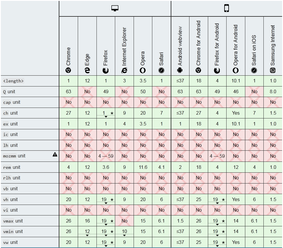
Note: There are a few units that are currently on a trial basis, so not many browsers support them. Be cautious while using any of them.
Basically, the units are divided into 2 groups: Absolute length units, and relative length units.
Absolute length units are commonly used in CSS, which helps you set an exact size.
| Unit | Name | Equivalent to |
|---|---|---|
| cm | Centimeters | 1cm = (1/2.54) of 1in |
| mm | Millimeters | 1mm = 1/10 of 1cm |
| Q | Quarter-millimeters | 1Q = 1/4 of 1mm |
| in | Inches | 1in = 2.54cm |
| pc | Picas | 1pc = 1/16 of 1in |
| pt | Points | 1pt = 1/72 of 1in |
| px | Pixels | Depends on the screen resolution |
Basically, most of the aforementioned units are not hard to understand, and do not require a lot of explanations, except for the Pixel unit which needs more interpretations.
In digital imaging, Pixel stands for Picture Element, it is a physical point of a Raster image. Raster is a technique of creating images by dividing image into a grid of small squares, each of which has a specific color and is the smallest unit to form a digital image.
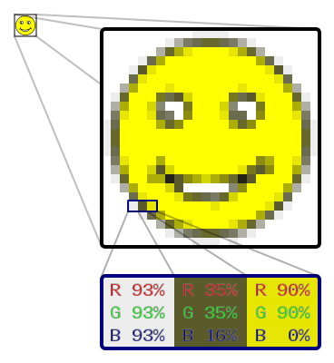
The more pixels there are in an Inch, the smoother the image is. The Pixel unit does not have a fixed physical value and it depends on the pixel density. In other words, it is up to the screen resolution of the device.

The pixels are minimal, so it is difficult for you to spot the squares unless you zoom in on the image.
The current popular screens have a resolution of 96 DPI, which means that in an Inch, there are 96 pixels, or there are about 37.79 pixels in 1 Centimeter.
The link below helps you convert the INCH, CM units into PIXEL with different resolutions:
See more:
Relative length units are widely used in CSS. They help you set a relative size to a certain element. For example, if you want the font size of the child element to be twice as much as the font size of the parent one, you will use the EM unit.

| Unit | Relative to (Liên quan đến) |
|---|---|
| em | Font size of the parent element. |
| rem | Font size of the root element (HTML element). |
| ex | x-height of the element's font. |
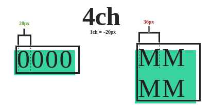
| ch | Width of the glyph "0" of the element's font. |
| lh | line-height of the element. |
| vw | 1% of the viewport's width. |
| vh | 1% of the viewport's height. |
| vmin | The smallest value in 2 values: vw, vh. |
| vmax | The largest value in 2 values: vw, vh. |
EM is a relative length unit. It can be used in every circumstance, such as setting the font size, the length, etc. 1em is the font size of the parent element.
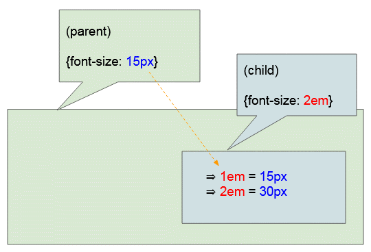
Provided that the parent element has the font size of {font-size: 15px} and the current element (the child element) has the font size of {font-size: 2em}, the result will be 1em = 15px, and 2em = 30px will be inferred.
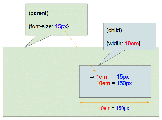
Provided that the parent element has the font size of {font-size: 15px}, and the current element (the child element) has the width of {width: 10em}, it will be 1em = 15px and 10em = 150px inferred. Therefore, the current element will have the width of 150px.
An example of the font size with the EM length unit:
unit-em-example.html
For instance, use length unit of EM with font-size, padding, margin, width, height, etc.
REM is a relative length unit. 1REM is the font size of the root element - <HTML>.
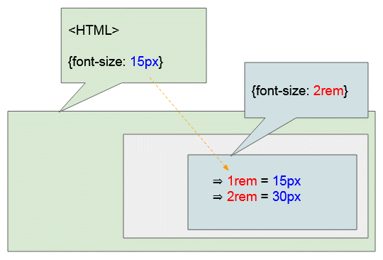
Assuming the HTML root element has the font size of {font-size: 15px} and the current element has the font size of {font-size: 2rem}, the result will be 1rem = 15px, and 2rem = 30px inferred.
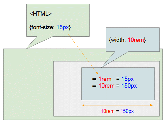
Provided that the parent element has the font size of {font-size: 15px}, and the current element (the child element) has the font size of {width: 10rem}, the result will be 1rem = 15px, and 10rem = 150px inferred. Therefore, the current element will have the width of 150px.
An example of the font size with the REM length unit:
unit-rem-example.html
Example, use the REM length unit with font-size, padding, margin, width, height, etc.
EX is a relative unit. It is equal to the x-height of the current element font.

EX is a relative unit. It is the width of the "0" glyph of the current element font.
LH is a relative unit, 1LH is equal to the line-height of the current element.
** This unit is still on a trial basis, so no browsers support it yet.
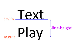
The line-height specifies the distance between the baselines of two lines. A baseline is the bottom of most letters.
VW
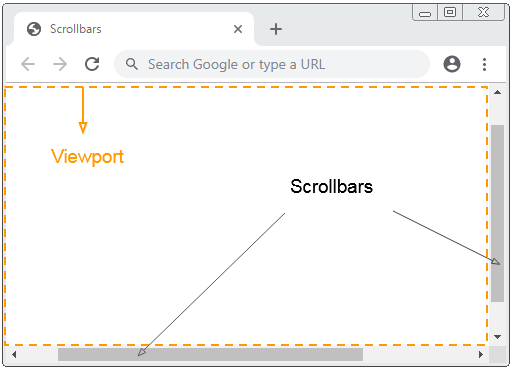
VW is short for Viewport Width and 1VW is equal to 1% of the Viewport width.
VH
VH is short for Viewport Height, and 1VH is equal to 1% of the Viewport height.
An example of the VW, VH:
vw-vh-example.html
VMin

VMIN is short for Viewport Minimum. VMIN is the minimum value of VW and VH.
VMax

VMAX is short for Viewport Maximum. VMAX is the maximum value of VW and VH.